Fonts are growing up like human beings. In the font you can read all our evolution, it’s like a cultural chromosomic code of our civilisation. But now we, like our ancestors who used to put signs on clay tablets, stones, papyrus and pieces of leather, we have a desire to put them on paper and the digital wall of our caves. So what is the difference? It makes me think that we are still alone here, we are still kids of obscurity, we are scared of ourselves, we speak to the Universe, we are quietly shouting, and we put in our hieroglyphs all our hope, love and fear, we speak to eternity and inquire of infinity “who we are, what we feel and where we are going?”. So if we can put a ton of information in writing, we can retrieve it from there also. Do you know how powerful letters are, do you?
We are the kids, little kids of the Universe, we again and again, century by century write our letters everywhere. Lets look at what message the different type of fonts bring home, and try to guess what they are telling us, who we are now and what we are all about.
I’ve prepared the font images to have some ideas what the font looks like and how you can play around with them. You can download a font by clicking on the name link or on the font image. Hope you find this collection useful.
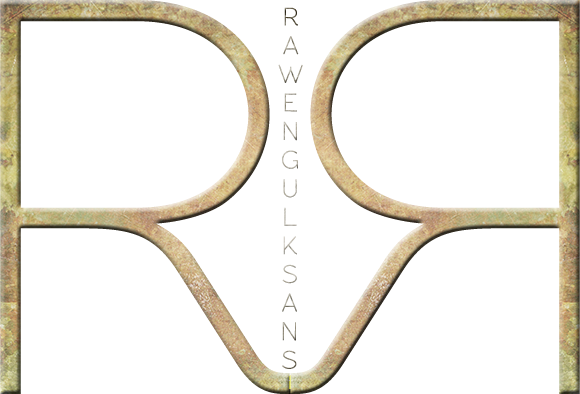
1. RawengulkSans by Glukfonts
Geometric, modern SansSerif font.
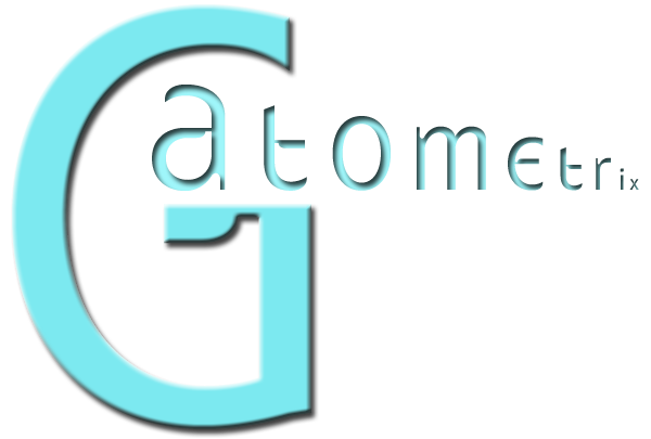
2. Gatometrix by Glukfonts
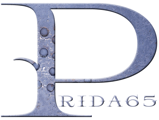
3. Prida65 by Glukfonts
Decorative, serif font Prida65 with ligatures, contextual alternates and stylistic set.
4. Biko Font Family by Marco Ugolini
This is a geometric sans serif with a strong and yet friendly character. The font is perfect for display, copy text and logos. The name is a tribute to Steve Biko: a South African anti-apartheid activist.

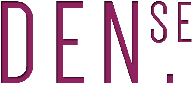
5. Dense typeface by Charles Daoud
Dense is a versatile, modern, compact sans serif typeface. It is currently available in three weights: thin, regular and bold.
6. Jockey by Veronika Burian and José Scaglione
Google commissioned the design of a new type family for it’s webfonts project. Jockey is based on the lettering by an unknown Argentine artist who designed posters for horse race tracks in the 1930’s. Out of a few upper case letterforms the TypeTogether team developed a full typeface that is now available for free at Google Webfonts.

7. Citizen Slab by Joel Felix
Citizen Slab is a typeface that pays homage to a vintage aesthetic without losing its modern sensibility. Inspired by a recent trip to Boston, which stirred up a strong feeling of patriotism…

8. Sreda by Elena Kowalski
Slab serif free font designed by Elena Kowalski, Russia.

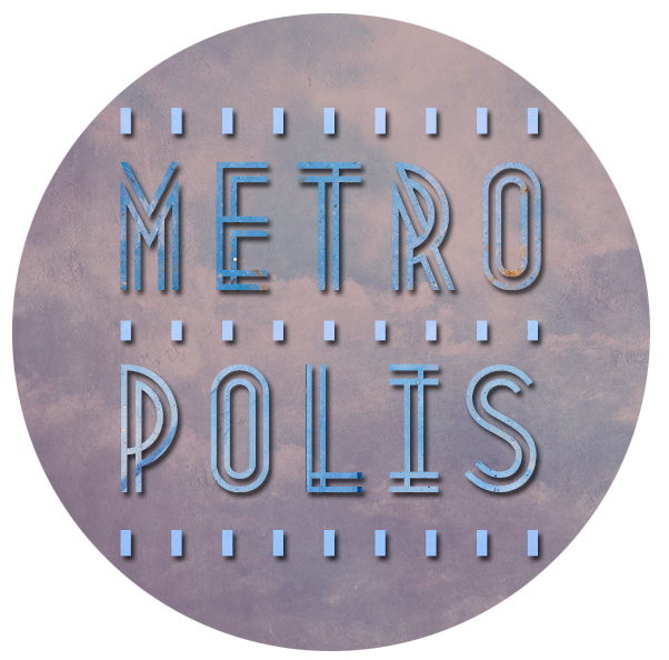
9. Metropolis by Josip Kelava
Metropolis 1920 comes from the industrial movement of the 1920’s where skyscrapers where born.
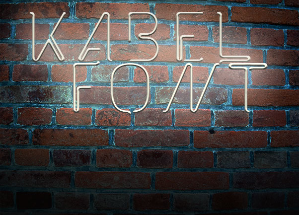
10. The Kabel Font by Mathias Nösel
This font is inspired by 3d artwork by Pablo Alfieri.
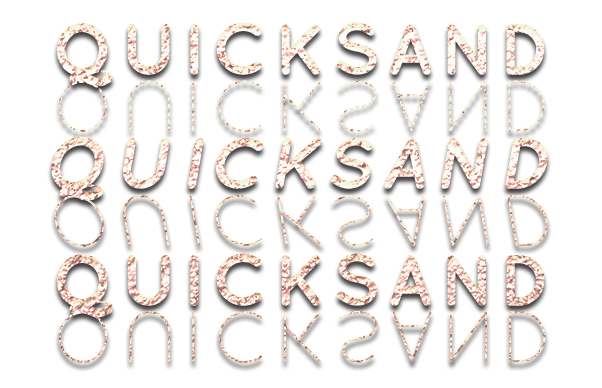
11. Quicksand by Andrew Paglinawan
Quicksand is a sans serif type family of three weights plus matching obliques and a dash version for display and headings. Influenced by the geometric-style sans serif faces that were popular during the 1920s and 30s, the fonts are based on geometric forms that have been optically corrected for better legibility.
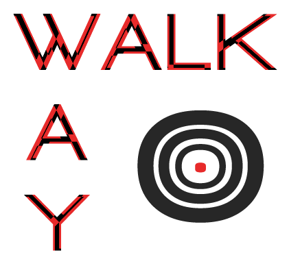
12. Walkway by Gemfonts
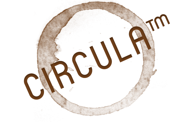
13. Circula by Jan Schmoeger
Circula™ is a simplified geometric display typeface based on circles. It contains capitals and small capitals only (no lower case), basic symbols, superior and inferior numbers and common fractions. It supports Eastern European, Baltic and Turkish character sets.
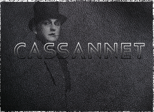
14. Cassannet by Atipo
Font Based on the Style of Lettering Seen on Cassandre Posters.
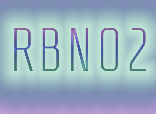
15. RBNo2 by Rene Bieder
It is inspired by late 19th century industrial fonts with german roots regarding straightness and geometry. Combined with other sans serifs, slab serifs and serif fonts it catches the eye when used in headlines and short copy texts. Additonally to the regular styles, the alternate versions will turn the font into a perfect partner for modern, technical and contemporary impressions as well as high quality, luxury and timeless environments.
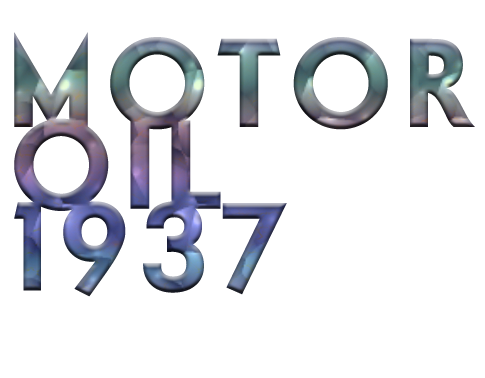
16. Motor Oil 1937 by Mohammed Rahman
Font inspired by vintage oil logos and some of the glyphs are based around Futura, especially the lower case letters.

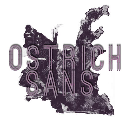
18. Ostrich Sans by Tyler Finck
A gorgeous modern sans-serif with a very long neck. With a whole slew of styles & weights. Ostrich Sans Inline is the most recent to the family and has basic international character support and an italic style.
19. Orbitron by Matt McInerney
Orbitron was designed so that graphic designers in the future will have some alternative to typefaces like Eurostile or Bank Gothic. If you’ve ever seen a futuristic sci-fi movie, you may have noticed that all other fonts have been lost or destroyed in the apocalypse that led humans to flee earth. Only those very few geometric typefaces have survived to be used on spaceship exteriors, space station signage, monopolistic corporate branding, uniforms featuring aerodynamic shoulder pads, etc. Of course Orbitron could also be used on the posters for the movies portraying this inevitable future.

20. Raleway by Matt McInerney
Raleway is an elegant sans-serif typeface, designed in a single thin weight. It is a display face that features both old style and lining numerals, standard and discretionary ligatures, a pretty complete set of diacritics, as well as a stylistic alternate inspired by more geometric sans-serif typefaces than it’s neo-grotesque inspired default character set.

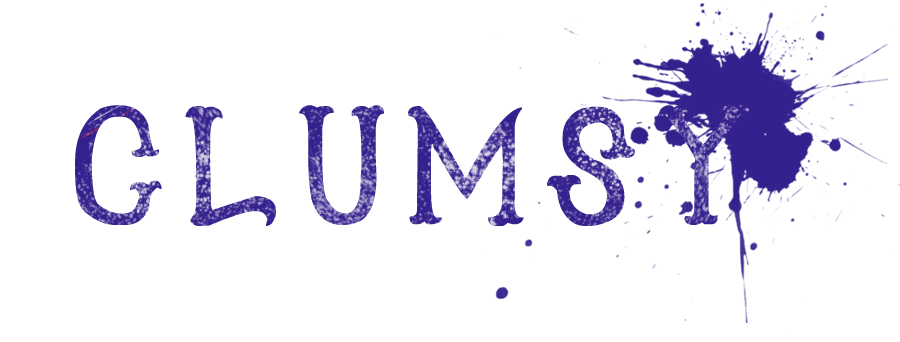
21. Clumsy by Kyle Steed
22. Decani Typeface by Neal Fletcher
A modern Art Deco typeface, available in Light, Medium and Bold as well as individually design Italics for each. Keeping the rounded corners was essential to give the typeface a modern and friendly feel whilst still keeping the Art Deco style. Decani also consists of a much more contemporary Stencil cut too, also in Light, Medium, Bold and Italics for each.

This is the end for now and have real fun bringing some special feeling to your next project by using one of the 20+ Interesting Free Font Faces for your Next Project Collection. And the last thing: your font choice can make or destroy your design, so use it wisely!